Lyrical Painting Project
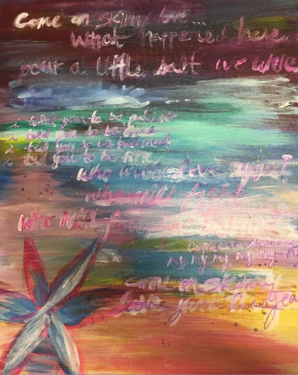
To express my song, Skinny Love, I tried to portray the feeling that my attitude and confidence has changed throughout my experience of dancing. At first, Skinny Love was a sad song to listen to, and I would listen to it when I would have a hard day in my ballet class whether I didn't feel good about my body, or how I danced that night, and listening to a sad song on the way home helped me to reflect on what I wanted to do better in the next class. But as I have grown as a dancer and developed a stronger confidence surrounding my capability, listening to Skinny Love reminds me of where I have come from and how much I have grown. In my painting, I begin with dark purple and blue colors, which eventually fade into light pink and yellow, demonstrating how I have gone from a negative to a positive place.
The process of layering paints was first having red paint line the bottom, with light colors up above. But this wasn't getting the message that I wanted across. I then experimented with white washes over what I had to try to blend it all in more, but it still wasn't what I was looking for. I first experimented with swatches of blue and yellow all over the painting, and then saw that I could still incorporate the dark to light color idea into my painting while still having it be overall "pretty."
From the beginning, it was a painting with a yellow column on one side, blue in the middle, and red on the bottom that all had paint dripping down the canvas. My final was a top-to-bottom dark to light color scheme that all blended in with each other with white and purple letters integrated into it. When people look at my painting, I want them to think about a time that they grew from a negative place into a positive place, and be proud of how they grew from it.
